as we say goodbye to the frigid temperatures, we're ready to rid ourselves of the gray "blahs" of winter and bring some color back into our lives. in honor of the return of spring, we're saluting the wonderful world of color.
first, some basic information that you learned when you were young, but you probably haven't thought about for awhile.


BASIC INFORMATION
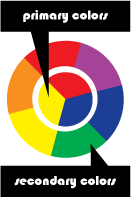
primary colors, red, yellow and blue are the three basic colors. any color can be created by mixing a certain percentage of each of these three colors. secondary colors are created by mixing the primary colors to create green, violet and orange. tertiary colors can also be created by mixing the secondary colors to get colors such as red-orange, blue-violet, and yellow-green. you can also control the intensity of each color, also known as the tint or the shade, giving the color a bolder or a more subdued intensity.
when choosing a color combination, there aren't really any "set in stone" rules, but there are some basic guidelines to make things easier to follow. complementary color schemes use colors that are opposite each other on the color wheel. blue and orange, yellow and purple, and red and green. when incorporating more than two colors in your combination, you can also use a triangle approach to combine yellow, blue and red, and violet, orange and green. analagous color combinations use colors that lay next to each other on the color wheel. using the analagous approach is a good way to give your work a "warm" or a "cool" feeling. The use of colors can create very powerful moods or feelings based on color combination and intensity.
COLOR FEELINGS
to help set the mood, here are some feelings associated with different basic colors:
- BLACK: strong, bold, solid
- WHITE: innocent, pure & clean
- RED: action, confidence, courageous, forceful, hot
- GREEN: masculine, nature, refreshing, technology, wealth, well-being
- PURPLE: good judgement, magic, peace of mind, royalty, spiritual
- BLUE: truth, loyalty, peaceful, youthful
- ORANGE: creative, endurance, stimulating, warmth, vitality
- YELLOW: joy, happiness, energy, trust
TECHNIQUES
using color selectively is a great way to create heirachy and highlight the most important information on a piece to make life easier for the viewer. using muted color tones can give softer, more sophisticated feelings, while a brighter, more in-your-face color pallete will give a fun, youthful feeling.
when choosing color, it's important to take a look at who your target audience while finding solution that will help the piece stand out in the crowd.
being great at choosing color takes a lot of hard work and practice. if you're looking for a place for inspiration, or if you just need help, there are some very helpful online resources:


