
spring fashion colors
hint at exotic destinations
The spring season has always been about renewal, new growth and fresh starts. For spring 2011 fashions, you can also add “escape” to the list.
Claiming inspirations from places like Africa, Greece, Peru, Turkey and the Caribbean, spring fashion will blossom with hues and tones that evoke exotic destinations. Leading fashion designers hope to help consumers feel a bit of escape from their everyday challenges through the intriguing color combinations.
"The colors designers have chosen for the spring season present an interesting marriage of unexpected warm and cool tones," said Leatrice Eiseman, executive director of the Pantone Color Institute® which identified the popular spring colors with their most recent survey of color trends. "By cleverly combining complementary colors, those that are opposites on the color wheel, they have created a striking intensity to the palette. These unique color combinations make it possible for consumers to pair existing pieces in colors traditionally associated with fall, with new favorites to punch up springtime wardrobes."
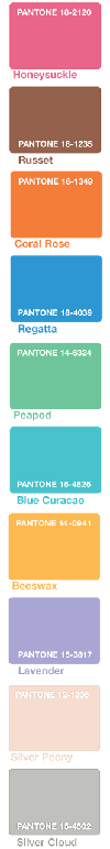
Look for wardrobes to break out of the winter blahs with splashes of playful Honeysuckle, spicy Coral Rose, warm and honeyed Beeswax and vibrant Regatta. This season’s palette is full of possible point-counterpoint combinations, like romantic, sensual Lavender paired with mellow Beeswax or Coral Rose.
The exotic location element of the spring colors comes through loud and clear with Blue Curacao, which stirs thoughts of tropical destinations. Traditional spring themes of new growth and rebirth echo in fresh yellow-green Peapod. So-called “nude hues” — Silver Peony, Russet and Silver Cloud — round out the color collection, providing a stable backdrop for the more flashy tones. It’s tempting to overlook or downplay these lower-key colors, but these tones provide a much-needed contrast that helps ramp up the visual vibrancy of the more intense colors.
Whether in fashion or marketing, color can send strong messages, said Julie Mangels, a graphic designer and owner of julsdesign. Making sure that those colors are sending the right messages is critical to modern branding.
“Today there are literally millions of colors available for use in print, electronic and online marketing materials,” said Mangels. “Being intentional about color selection is very important since color can strongly communicate brand messages and stir emotions and reactions in people. Just as the wrong colors can confuse or muddle your branding positions, the right colors can greatly amplify and re-enforce your image and positioning. We’re always interested in fashion colors because they usually help identify national moods and attitudes and give us ideas we can pass on to our clients.”
For 17 years, Pantone, the global authority on color, has surveyed the designers of New York Fashion Week and beyond to bring you the season’s most important color trends. This report previews the most prominent hues for spring 2011.